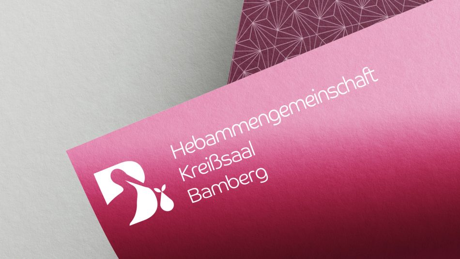
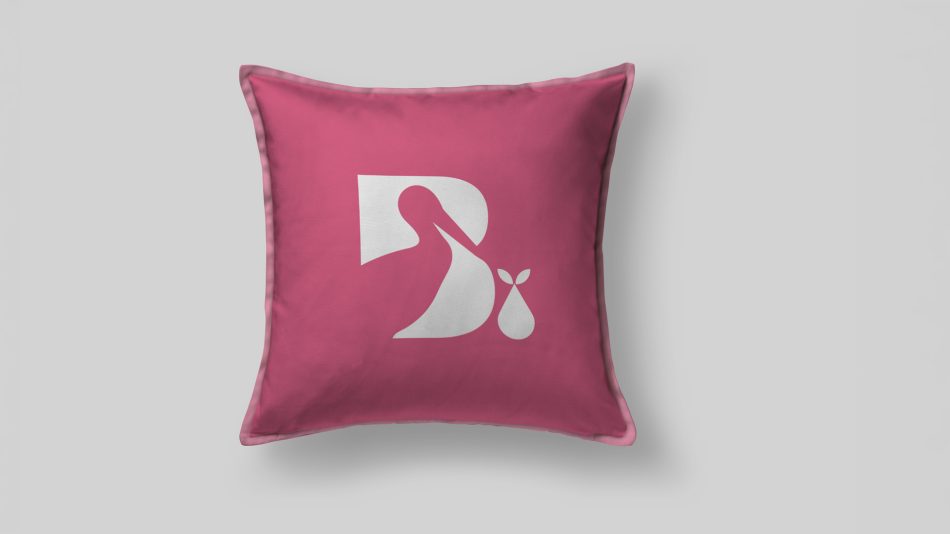
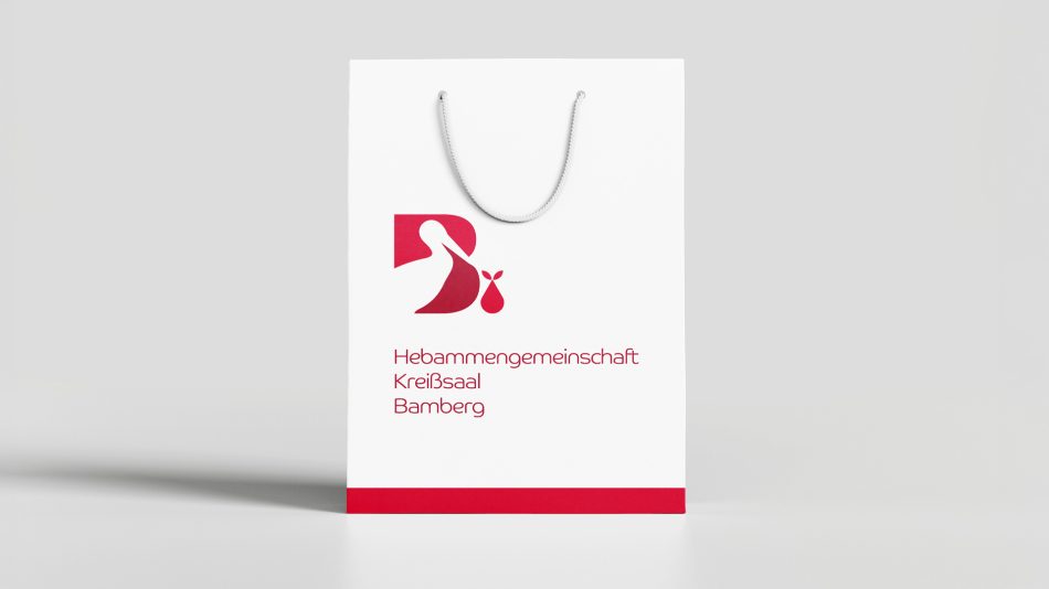
A visual identity created for a midwifery practice in Bamberg. The symbol combines the silhouette of a stork with the letter “B” and a subtle reference to new life, creating a distinctive and approachable mark for maternity care.
The identity balances professionalism with warmth and was designed to work consistently across staff identification, printed materials and promotional applications.